What percentage of visitors do you think will abandon your store if they deem it ‘messy’?
52%? 79%? 40%?
As I was preparing to write this article, I recalled an experience I had a number of years ago when I was searching for a house to purchase.
I had been scouring listings online and was lucky enough to find a few houses that met my ‘must have’ list. I emailed my realtor the listing numbers and she made arrangements for us to view the homes over the next number of days. Yah!
I was really excited about one of the homes in particular. It had great curb appeal and I couldn’t wait to get inside and experience it all first hand.
Short story, shorter.
My realtor and I walked in the front door…
…and that’s literally as far as we got. One quick glance from inside the doorway, and the anticipated thrill of the experience was abandoned.
Not only was it messier than a teenage boy’s room (well, my own teenager anyway), but let’s just say it didn’t smell like grandma's cookies were about to come out of the oven either.
Did anything distract me from finding what I was looking for? Was there anything causing me to abandon my plans to continue looking through the home? Multiple yes’s to both those questions, lol.
So how does this experience translate to design importance on your online store?
Keep reading!
What Do Website Visitors Say About Design?
Let’s look at a couple of statistics:

75% of users admit they have made judgements on a company’s credibility based on their website’s design

85% of website users first impressions are design related
(Source: Design Resources)
Wow! So knowing this, does it change your answer about what percentage of visitors you think would abandon your store if they deemed it ‘messy’? 52%? 79%? 40%?
I’m a ‘visual’ person, so of course I was like “it’s definitely 79%”.
So, imagine my surprise when I learned that it’s actually just 40%!
That’s right. 60% don’t actually care if your site looks ‘messy’! They’ll look past that and continue to browse!
Whaaaaat?!!
(Maybe I should have done the same when I was house hunting.)
So What Elements DO Have The Largest Impact On An Online Store’s Design?
Well, I did a LOT of reading, and below are 8 things that have a higher impact on a users experience.
1). 74% of people are likely to return to a website if it is optimized for mobile.
In fact, according to Google, 48% of customers started searching for the product they bought on a mobile first!
(Source: Google, 2018)
Design tip: 👏Design 👏for 👏mobile!
- Make it fast loading – 40% of users will abandon a site after 3 seconds
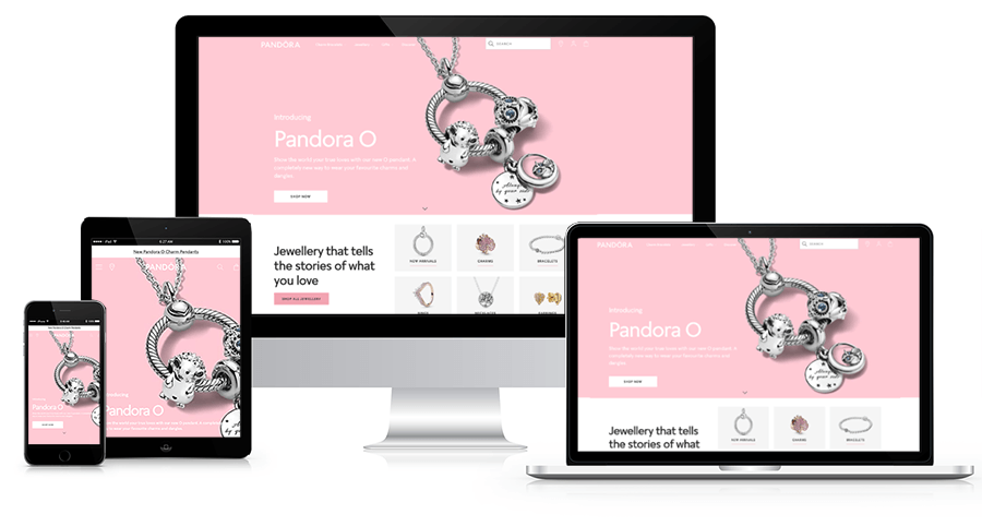
- Make it ‘responsive’ – no matter the size of the users screen, the information adjusts perfectly to fit
- Make it easy to navigate – organize your products into clear categories

2). 79% of users who don’t find what they are looking for on one website, will go on searching on other websites.
If you simply don’t offer a product they’re looking for, well, then there’s nothing much you can do about that. BUT, if you DO offer a product they’re looking for, use this design tip:
Try adding a search bar, or simplify your navigation by organizing products into categories in order to keep customers from dropping off your page.
3). 86% of users want to see information about products once they land on your homepage.
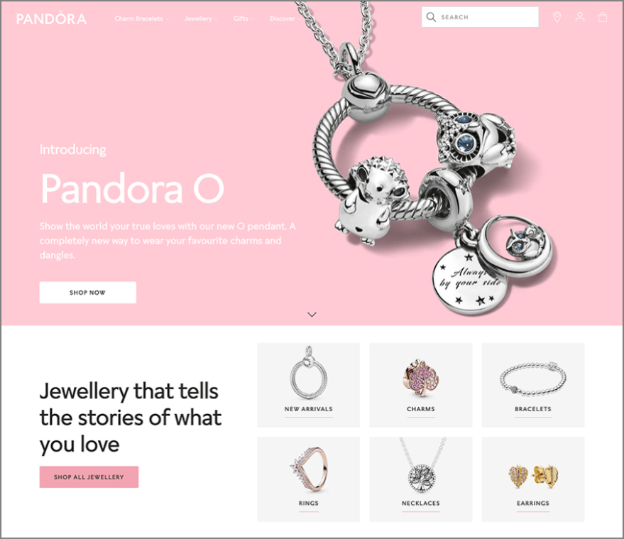
Design tip: Design your store so it shows images of product categories on your homepage. Let’s say you have a jewelry store. Have clickable images for necklaces, bracelets, earrings, rings, top sellers, etc. on your homepage.
Not only will this add visual appeal, but it gives your visitors quick access to your categories without having to dig through menus.

4). 70% of users look at lists with bullets while only 55% look at lists without bullets.
(Source: Red Website Design)
Design tip: Use bullet point lists in your product descriptions to not only show better organized information, but bullet points are:
- quicker-to-read
- easier to remember
- (see what I did there? 👆😁)
5). 65% of website visitors would refuse to fill a form if it asked for too much personal information.
Design tip: Only take the necessary information needed in order to process an order. You don’t need to know their gender, their birthdate, their dogs name or how many toes they have.
If you have a customer area on your site (recommended), customers can simply update their profile with additional information at another time.
6). 63% of people would consider messaging a chatbot to communicate with a business or a brand.
(Source: Mindshare)
Design Tip: Get a chatbot!! This provides an excellent opportunity to ‘instantly’ connect with potential customers who may have unanswered questions.
7). 61% of shoppers didn’t finish their purchase because trust logos were missing.
(Source: Shopify)
Design Tip: 👏Don’t 👏forget 👏the👏 trust 👏logos! Be sure to include SSL certificate badges, payment/shipping method badges, and security seals like Norton or McAfee so that your customers can be rest-assured that their payment information is safe.

8). 54% cited ad clutter as the biggest obstacle to good user experience.
(Source: (ClickZ)
Design tip: If you’re placing ‘ads’ on your site, be selective. You don’t want to distract your customers while they’re shopping in your store with too many popup windows and flashing banners.
An additional option could be adding a ‘customers who bought this, also bought this’ or a ‘you may also like this' feature to your site as a way to help increase your average order value.
Here’s a little BONUS information for you…
…only 1% of users click on slider content.
(Source: Erik Runyon)
I know, I know, ‘they’re beautiful’, ‘they allow for additional content to be shown’, ‘they’re interactive’, ‘so many online stores have them’! BUT, if only 1% of users are clicking on them, it might be better to ditch the image slider idea and reduce page load times by using a single static image instead.
Designing A Greater User Experience = A Greater Conversion Rate Boost
We’ve learned that ‘design’ is far more than just color palette and images. It’s about designing a great user experience. In fact, according to Forbes, designing a great user experience can boost your website’s conversion rate by 200-400%! Wow!
So what’s the next step?
Setting Up The Design & User Experience Of Your Dropshipping Store
If you’re feeling a little freaked out, don’t worry. I’ve been a web/graphic designer for more than a couple of decades now, so I know at first just how overwhelming it can be to set up a site that’s designed for a great user experience.
Here’s some good news…
…there are some really great ‘themes’ you can purchase and install on your store that have already been designed for both aesthetics and conversions.
We’ll save all the juicy details and recommendations for another article, but I’ve listed a few links below that you can start exploring:
- Theme Forest’s 2019's Best Selling Shopify Themes – updated weekly
https://themeforest.net/popular_item/by_category?category=ecommerce/shopify - Theme Forest’s 2019's Best Selling WooCommerce Themes – updated weekly
https://themeforest.net/popular_item/by_category?category=wordpress/ecommerce/woocommerce - Shoptimized Theme – proven to convert!
https://shoptimized.net/theme/
What Should You Remember About The Importance Of Design On Your Dropshipping Store?
As you look at themes, remember to ask yourself the following:
1. Is it optimized for mobile users? Does it load fast?
2. Does it have a search feature?
3. Can customers easily access product information from the homepage?
4. Is the information organized and easy to read?
5. Does it offer a customer area?
6. Does it have a chatbox? Can one be added?
7. Are trust logos easily visible?
8. Is it ‘cluttered’ looking?
Thanks for reading! I hope this information helps you in your journey of designing a great user experience for your potential customers. If you’d like to stay up-to-date with all important things related to dropshipping and e-commerce, like our facebook page and get all the information as soon as we release it.


